Non-text Content
- Level
- A
- Criterion
- 1.1.1
- Content
- Audio
- Icon
- Image
- Text
- Video
All non-text content that is presented to the user has a text alternative that serves the equivalent purpose, except for the situations listed below.
Controls, Input
If non-text content is a control or accepts user input, then it has a name that describes its purpose. (Refer to Success Criterion 4.1.2 for additional requirements for controls and content that accepts user input.)
Time-Based Media
If non-text content is time-based media, then text alternatives at least provide descriptive identification of the non-text content. (Refer to Guideline 1.2 for additional requirements for media.)
Test
If non-text content is a test or exercise that would be invalid if presented in text, then text alternatives at least provide descriptive identification of the non-text content.
Sensory
If non-text content is primarily intended to create a specific sensory experience, then text alternatives at least provide descriptive identification of the non-text content.
CAPTCHA
If the purpose of non-text content is to confirm that content is being accessed by a person rather than a computer, then text alternatives that identify and describe the purpose of the non-text content are provided, and alternative forms of CAPTCHA using output modes for different types of sensory perception are provided to accommodate different disabilities.
Decoration, Formatting, Invisible
If non-text content is pure decoration, is used only for visual formatting, or is not presented to users, then it is implemented in a way that it can be ignored by assistive technology.
Audio-only and Video-only (Prerecorded)
- Level
- A
- Criterion
- 1.2.1
Prerecorded audio-only and video-only content provides an alternative medium.
- Content
- Audio
- Text
- Video
For prerecorded audio-only and prerecorded video-only media, the following are true, except when the audio or video is a media alternative for text and is clearly labeled as such:
Prerecorded Audio-only
An alternative for time-based media is provided that presents equivalent information for prerecorded audio-only content.
Prerecorded Video-only
Either an alternative for time-based media or an audio track is provided that presents equivalent information for prerecorded video-only content.
Captions (Prerecorded)
- Level
- A
- Criterion
- 1.2.2
Prerecorded audios provide captions.
- Content
- Audio
Captions are provided for all prerecorded audio content in synchronized media, except when the media is a media alternative for text and is clearly labeled as such.
Audio Description or Media Alternative (Prerecorded)
- Level
- A
- Criterion
- 1.2.3
Prerecorded videos provide audio or text descriptions.
- Content
- Audio
- Video
An alternative for time-based media or audio description of the prerecorded video content is provided for synchronized media, except when the media is a media alternative for text and is clearly labeled as such.
Captions (Live)
- Level
- AA
- Criterion
- 1.2.4
Live videos provide live captions.
- Content
- Audio
- Video
Captions are provided for all live audio content in synchronized media.
Audio Description (Prerecorded)
- Level
- AA
- Criterion
- 1.2.5
Prerecorded videos provide audio descriptions.
- Content
- Audio
- Video
Audio description is provided for all prerecorded video content in synchronized media.
Sign Language (Prerecorded)
- Level
- AAA
- Criterion
- 1.2.6
Prerecorded videos provide sign language for audio content.
- Content
- Audio
- Video
Sign language interpretation is provided for all prerecorded audio content in synchronized media.
Extended Audio Description (Prerecorded)
- Level
- AAA
- Criterion
- 1.2.7
Prerecorded videos provide more detailed audio descriptions.
- Content
- Audio
- Video
Where pauses in foreground audio are insufficient to allow audio descriptions to convey the sense of the video, extended audio description is provided for all prerecorded video content in synchronized media.
Media Alternative (Prerecorded)
- Level
- AAA
- Criterion
- 1.2.8
Prerecorded audio and video content provide text alternatives.
- Content
- Audio
- Video
An alternative for time-based media is provided for all prerecorded synchronized media and for all prerecorded video-only media.
Audio-only (Live)
- Level
- AAA
- Criterion
- 1.2.9
Live audio-only content provides live text alternatives.
- Content
- Audio
- Video
An alternative for time-based media that presents equivalent information for live audio-only content is provided.
Info and Relationships
- Level
- A
- Criterion
- 1.3.1
Information, structure and relationships are available as text (at least in the backend).
- Content
- Audio
- Color
- Heading
- Icon
- Image
- Input
- Label
- Text
- Video
Information, structure, and relationships conveyed through presentation can be programmatically determined or are available in text.
Meaningful Sequence
- Level
- A
- Criterion
- 1.3.2
Code provides the right sequence of the content.
- Development
When the sequence in which content is presented affects its meaning, a correct reading sequence can be programmatically determined.
Sensory Characteristics
- Level
- A
- Criterion
- 1.3.3
Use sensory characteristics, but always offer text alternatives, because not every person can perceive them.
- Content
- Audio
- Color
- Heading
- Icon
- Image
- Label
- Layout
- Responsive
- Text
- Video
Content and functions
- Use sensory characteristics.
- Don’t rely solely on sensory characteristics.
- Always add text alternatives.
Characteristics
- Shape
- Color
- Size
- Visual location
- Orientation
- Sound
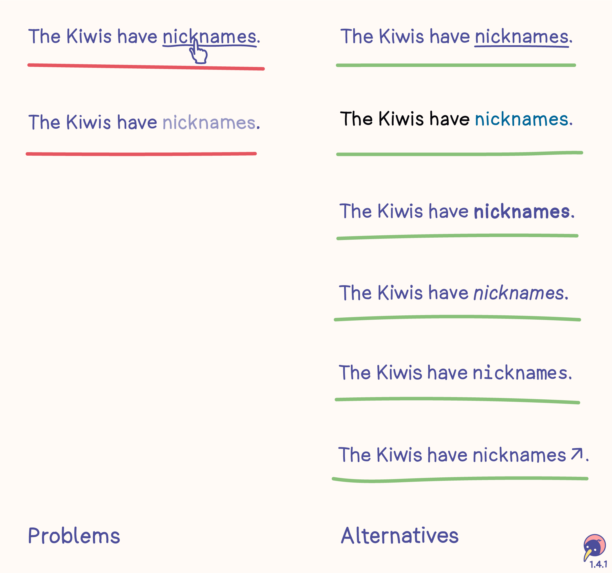
Shape
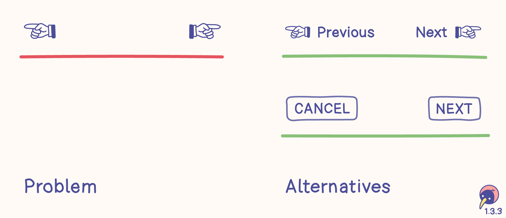
Problem
- Shapes don’t help screen readers identifying the meaning.
- Some shapes can be difficult to distinguish.
- Shapes can convey different meanings.
Alternatives
- Words can be identified by screen readers.
- Simple words support the meaning of the shape, for example “Previous” or “CANCEL” would have different meanings.
- Words also work without shapes – use them, but make sure the content or functions benefit from shapes!
Color
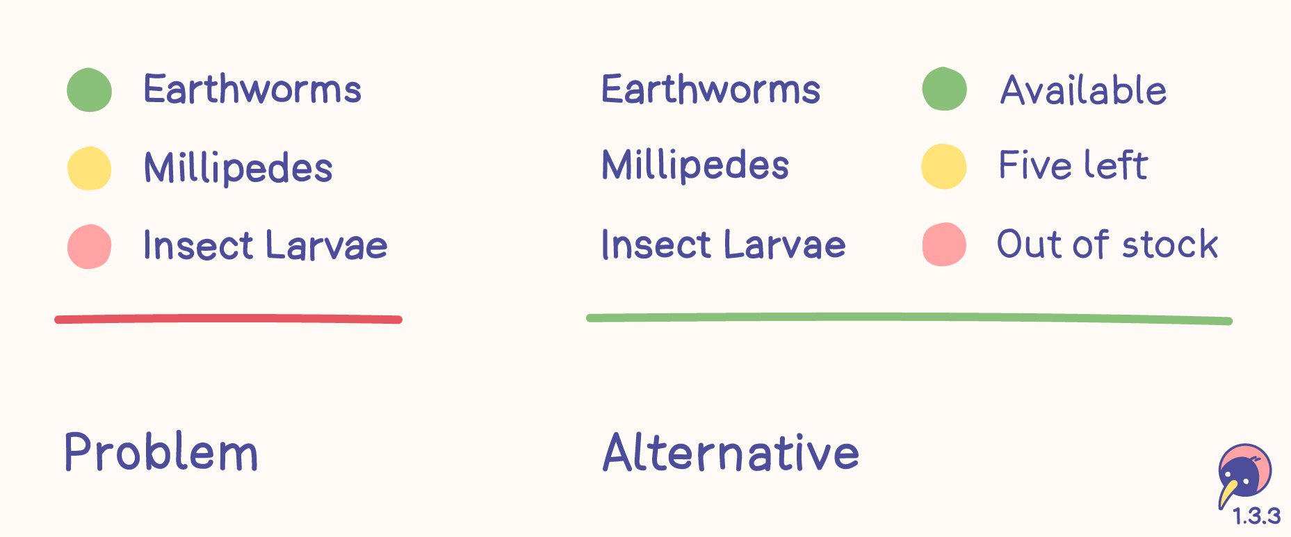
Problem
- Colors don’t help screen readers identifying the status.
- Different individuals and different cultures may perceive colors differently, leading to varied interpretations.
Alternative
- Words can be identified by screen readers.
- Text clarifies the meaning.
- Words also work without colors – use them, but make sure the content or functions benefit from colors!
Size
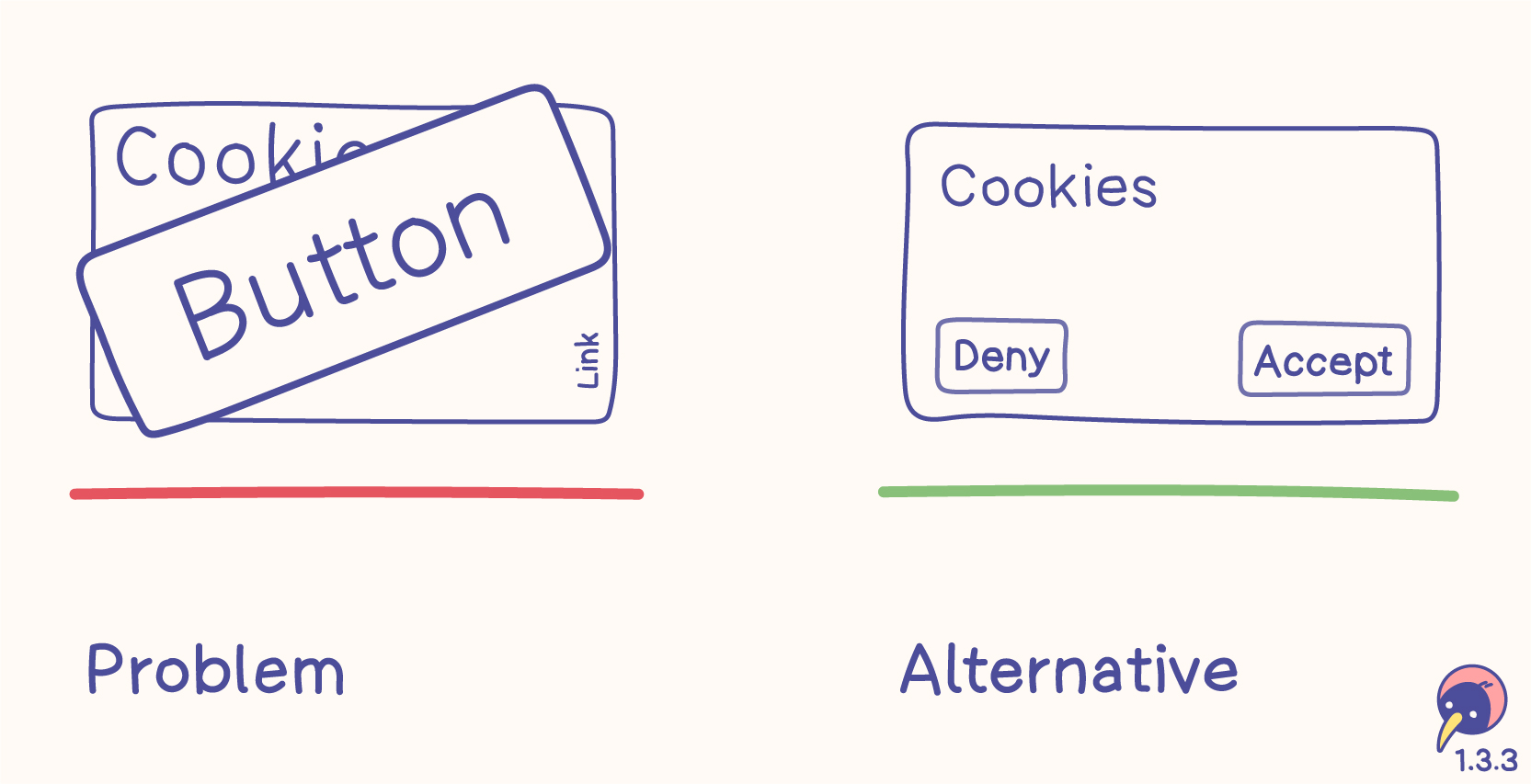
Problem
- Sizes don’t help screen readers identifying the purpose.
- Cookie banners keep misusing sizes – we shouldn’t sink so low, especially not in the EU.
Alternative
- Words can be identified by screen readers.
- Keeping sizes on a fair level helps every user.
- Words also work without sizes – use them, but make sure the content or functions benefit from sizes!
Visual location
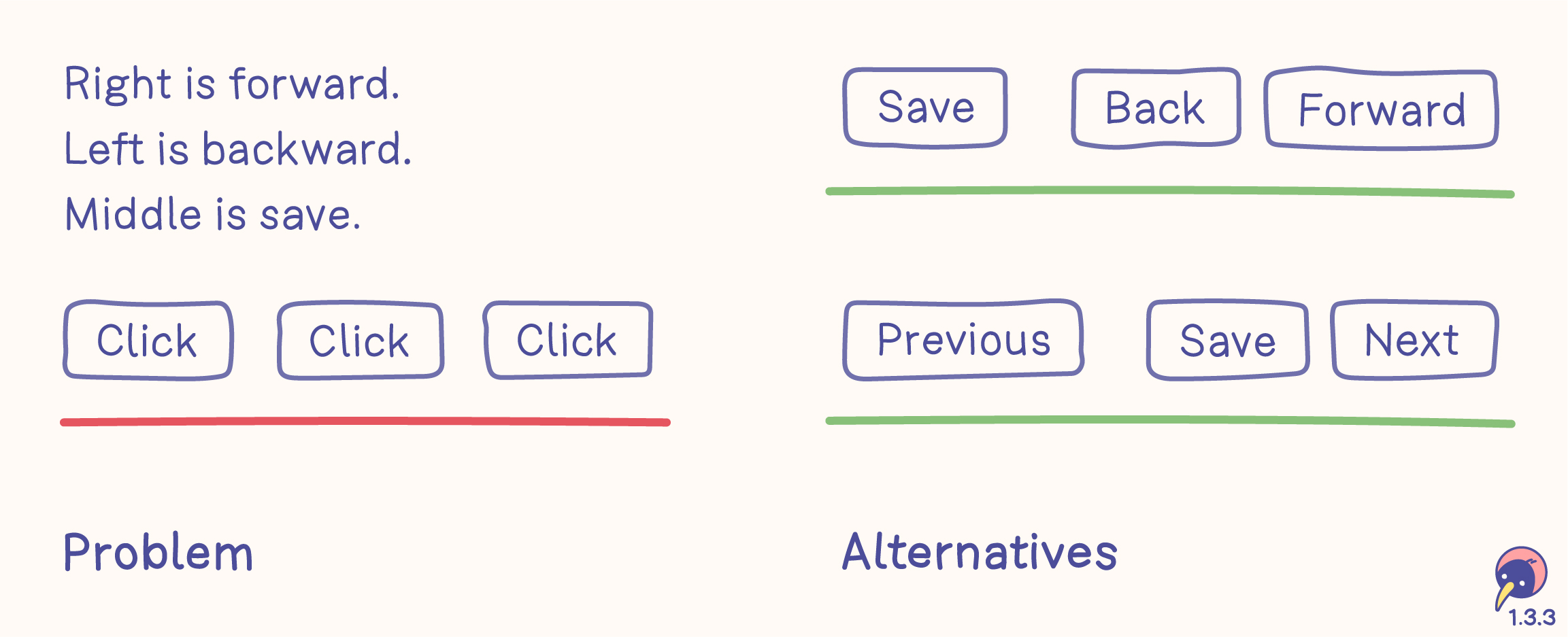
Problem
- Visual locations don’t help screen readers identifying the function.
- Connecting instructions with visual locations is an exhausting riddle.
Alternatives
- Words can be identified by screen readers.
- Text on buttons clearly defines their functions.
- Visual locations of the buttons support their functions.
- Words also work without visual locations – use them, but make sure the content or function benefit from visual locations!
Instagram links
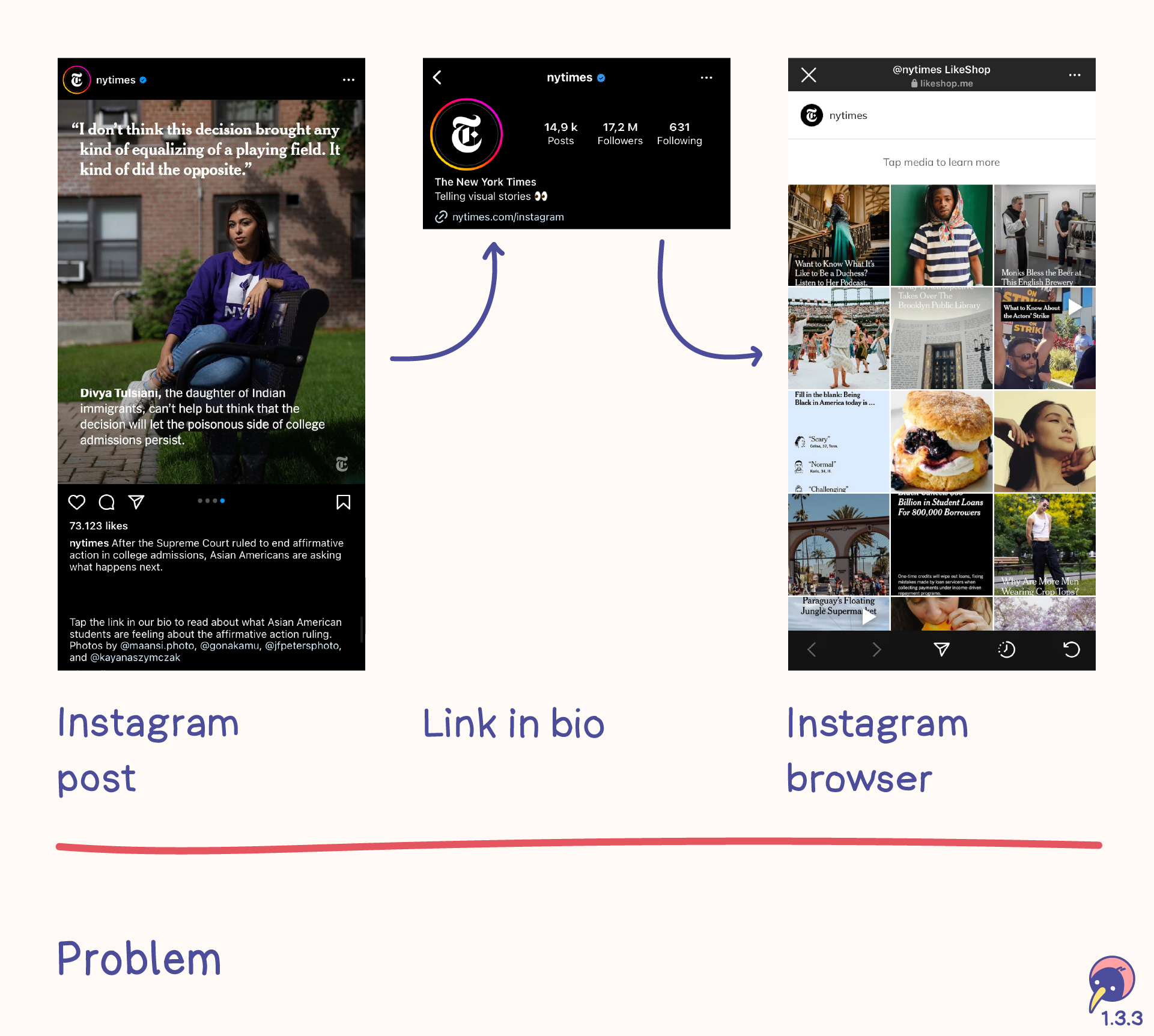
Platforms with longer texts usually upload a preview to Instagram and include the instruction to click the link in their bio. This link opens an internal browser to a page with a list of all uploads on Instagram.
- Moving from the post to the link in the bio is a very exhausting process and difficult to handle.
- The link in the bio opens the instagram browser on first click. This browser can’t be configured and doesn’t offer any tools.
- Finding a post in the list relies on remembering the first picture of the post and identifying it in the list. This is difficult for everyone.
- If the link is added to the description, Instagram doesn’t make it clickable.
Orientation
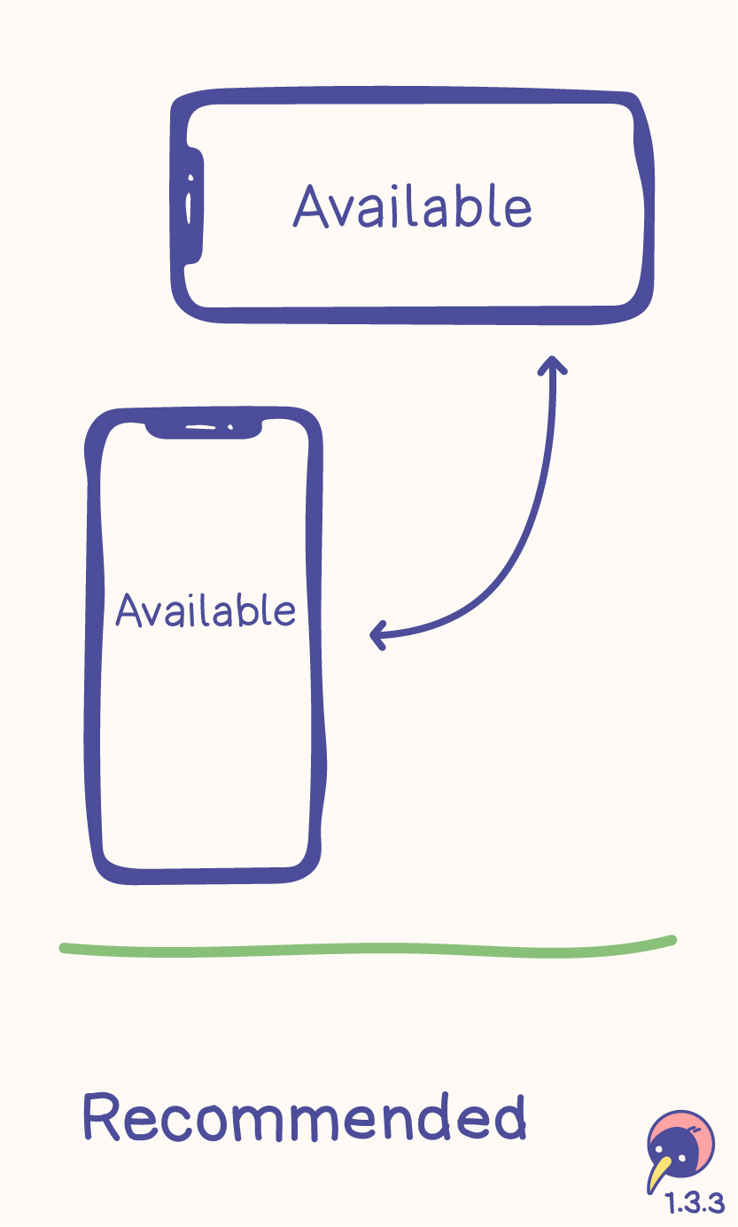
Content and functions should be available with every screen orientation. See 1.3.4 Orientation for more details.
Sound
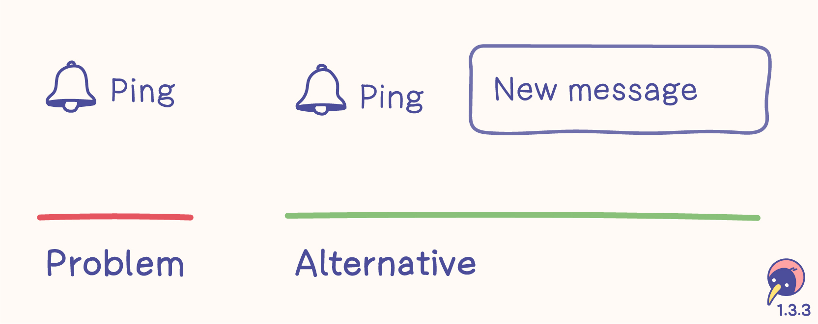
Problem
- Sounds can’t be perceived by everyone, for example not by deaf people.
- Sounds can’t be perceived all the time, for example when volume is turned off.
Alternative
- Words can be identified by screen readers.
- Words can be visible.
- Words also work without sounds – make sure the content or functions benefit from sounds!
Users
- You and me
- People with technology, for example screen readers
- People with disabilities, for example color blindness
- People with congnitive limitations, who benefit from visuals
- People with visual perception
Relations
- 1.3.4 Orientation (AA) clearly requires the screen orientation.
- 1.4.1 Use of color (A) focusses on color.
Instructions provided for understanding and operating content do not rely solely on sensory characteristics of components such as shape, color, size, visual location, orientation, or sound.
Orientation
- Level
- AA
- Criterion
- 1.3.4
Everything is as responsible as possible and usable with any display orientation.
- Content
- Responsive
Content does not restrict its view and operation to a single display orientation, such as portrait or landscape, unless a specific display orientation is essential.
Note
Examples where a particular display orientation may be essential are a bank check, a piano application, slides for a projector or television, or virtual reality content where content is not necessarily restricted to landscape or portrait display orientation.
Identify Input Purpose
- Level
- AA
- Criterion
- 1.3.5
Code identifies the purpose of the inputs and enables auto-complete.
- Development
The purpose of each input field collecting information about the user can be programmatically determined when:
The input field serves a purpose identified in the Input Purposes for user interface components section; and
The content is implemented using technologies with support for identifying the expected meaning for form input data.
Identify Purpose
- Level
- AAA
- Criterion
- 1.3.6
Code identifies as much information as possible.
- Development
In content implemented using markup languages, the purpose of user interface components, icons, and regions can be programmatically determined.
Use of Color
- Level
- A
- Criterion
- 1.4.1
Use colors, but never rely solely on colors, as some people might not be able to distinguish them.
- Content
- Color
- Icon
- Image
- Text
Content and functions
- Use colors.
- Don’t rely solely on colors.
- Always add visible alternatives.
- This criterion focuses on people with visual impairments without assistive technology.
Visible alternatives
- Icon
- Typography
- Symbol
- Pattern
- Contrast
- Text
Examples
Colors are used in a wide variety. These examples are very basic.
Form verification
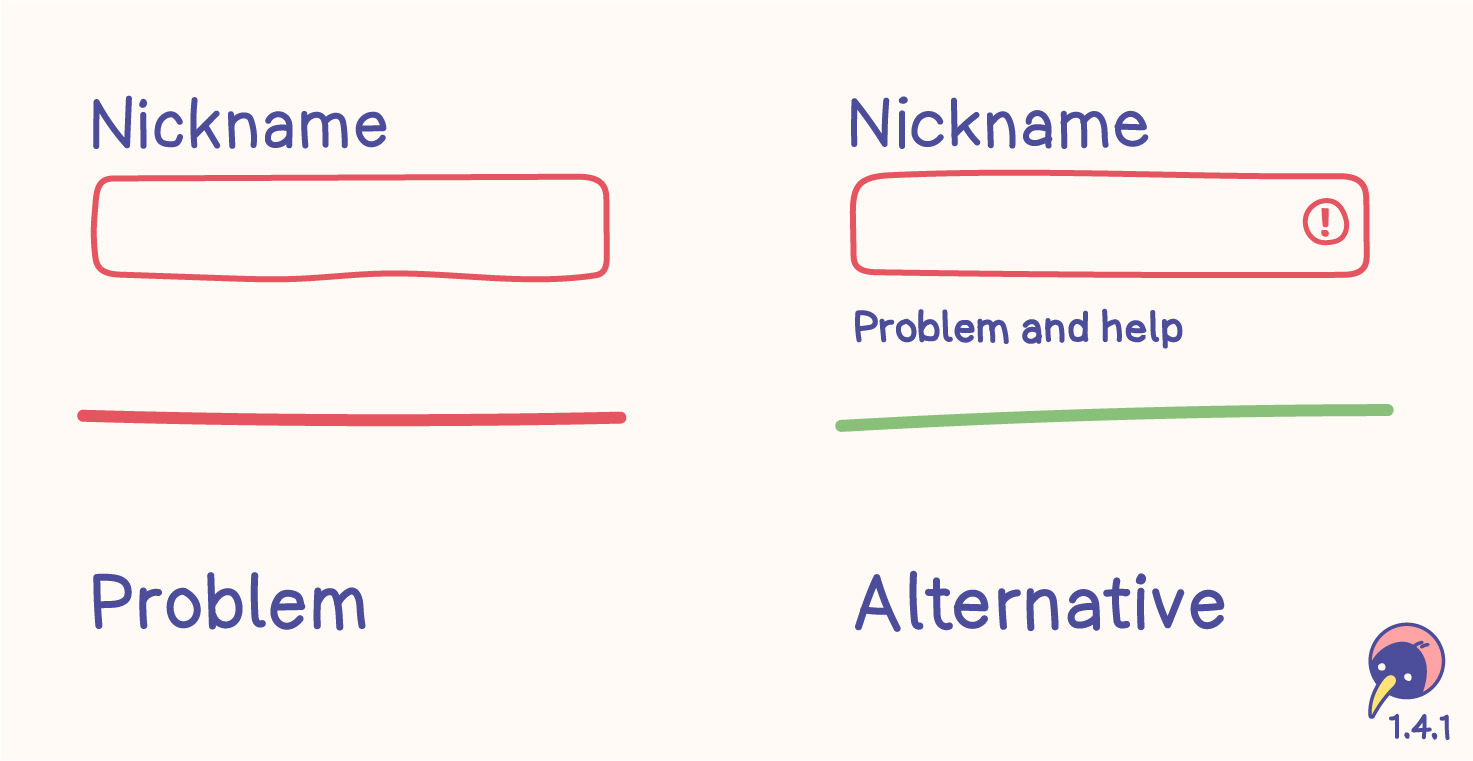
Problem
- Some people have difficulty distinguishing between the neutral and red borders.
- Problems can’t be identified and no help is offered.
Alternative
- Symbols are hints without relying on color.
- Text is a clear definition without relying on color. It supports clarifying the problem and helps solving it. Moreover, text is a part of 3.3.1 Error identification.
- The text color needs enough contrast.
Disabled elements
This criterion doesn’t mention disabled elements. Even though disabled input fields shouldn’t be used at all, they would need more than just a lighter color.
Inactive components are also mentioned in 1.4.3 Contrast (minimum), increasing the recommendation of avoiding disabled elements.
Links within text
Problems
- Limiting the difference between text and links to a hover effect basically makes links invisible. They can only be found by hovering with the assumption it might be a link.
- Changing the color of links without sufficient contrast may make them difficult to identify for some users.
Alternatives
- The common way of visualizing links is setting an underline which is always visible.
- If the design would like to focus on a different color, the color needs to have a contrast of 3:1 to the text color and 5:1 to the background color. Since it relies on contrast, only two states are possible, for example “normal text” and “link”. More details are in Technique G183.
- typographic options, for example bold, italic or a clearly visible alternative font
- symbols aligned with the link, for example an arrow
Links outside text
This example doesn’t include links outside text. They don’t necessarily adhere to these alternatives, as they can be identified based on their page context, for example header or navigation.
Map
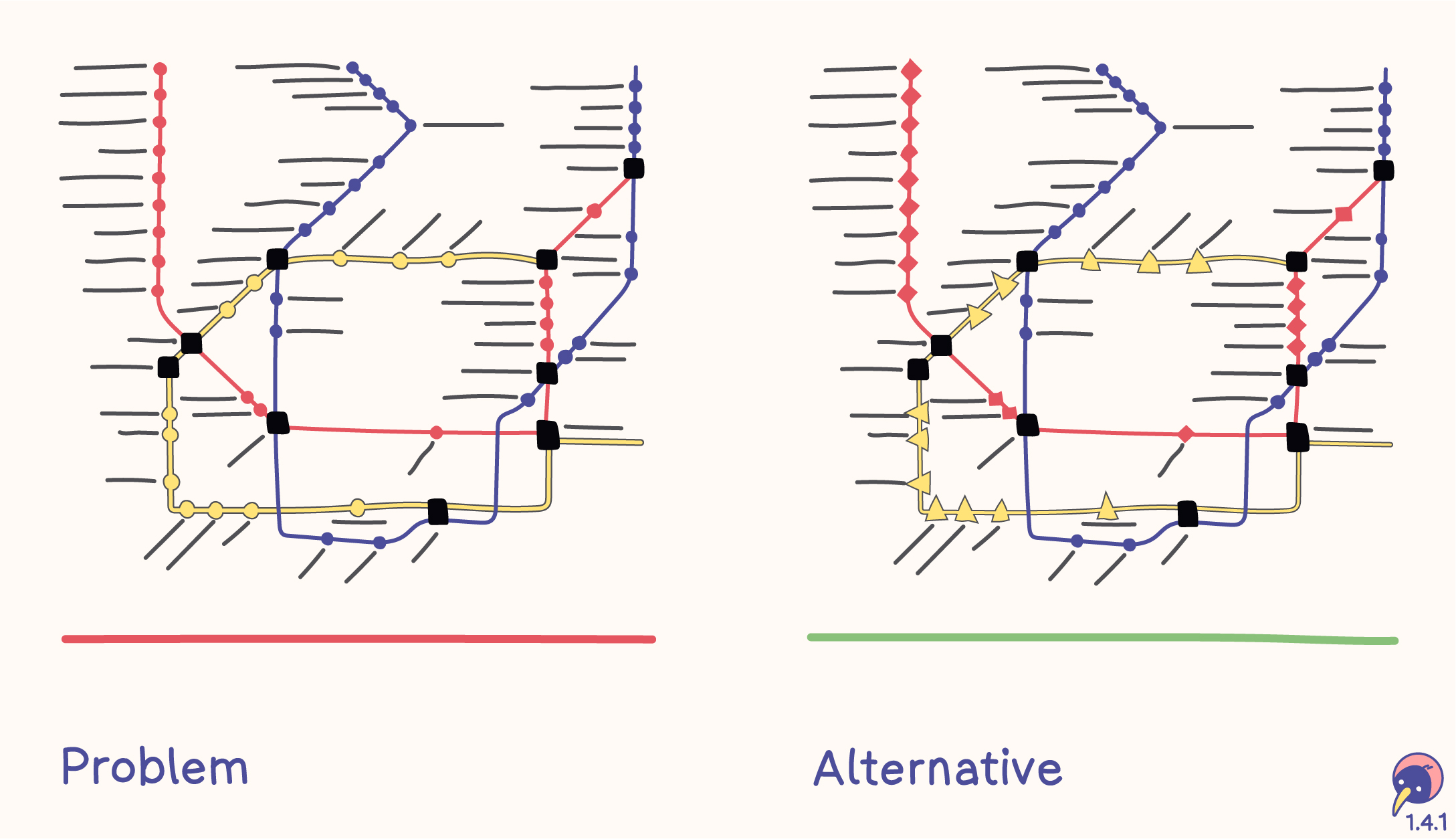
Problem
- The map of a transportation system only displays each route in a different color.
- Each stop is marked with a circle.
Alternative
- Each route has a color and a symbol.
- Each stop is marked with the symbol of the route.
Chart
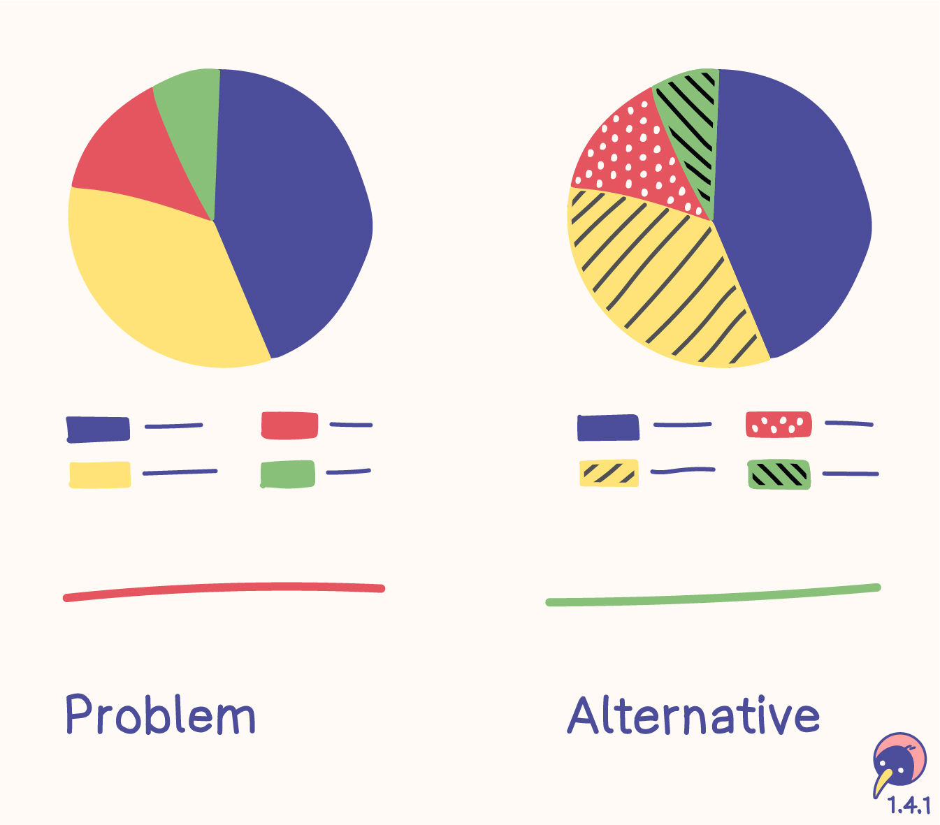
Problem
- A chart with four areas differentiates them solely based on colors
- The labels of the charts are associated only with the colors.
Alternative
- Each bar is filled with a unique pattern.
- The labels of the charts are associated with the patterns.
Users
- people who can’t distinguish colors and don’t use assistive technology
- people with limited technology, for example monochromic displays
- people who benefit from colors
- Around 8 % of men are colorblind – this should convince the old white men in the boardrooms to invest into accessibility.
Tools
Relation
- 1.3.3 Sensory characteristics (A) includes color, however, it always relies on text alternatives.
Color is not used as the only visual means of conveying information, indicating an action, prompting a response, or distinguishing a visual element.
Audio Control
- Level
- A
- Criterion
- 1.4.2
Autoplaying audio (longer than 3 seconds) can be stopped, paused or turned quieter.
- Function
- Audio
If any audio on a web page plays automatically for more than 3 seconds, either a mechanism is available to pause or stop the audio, or a mechanism is available to control audio volume independently from the overall system volume level.
Note
Since any content that does not meet this success criterion can interfere with a user's ability to use the whole page, all content on the web page (whether or not it is used to meet other success criteria) must meet this success criterion. See Conformance Requirement 5: Non-Interference.
Contrast (Minimum)
- Level
- AA
- Criterion
- 1.4.3
Text has high contrast (4.5:1 or 3:1) to be readable for everyone everywhere.
- Content
- Color
- Image
- Text
Sizes
- “Normal” text with 16 pt normal needs a contrast ratio of at least 4.5:1.
- “Large” text with 18 pt normal or 14 pt bold needs a contrast ratio of at least 3:1.
- Sizings have evolved – the values in pt are just a guideline.
- The contrast can be higher than these requirements!
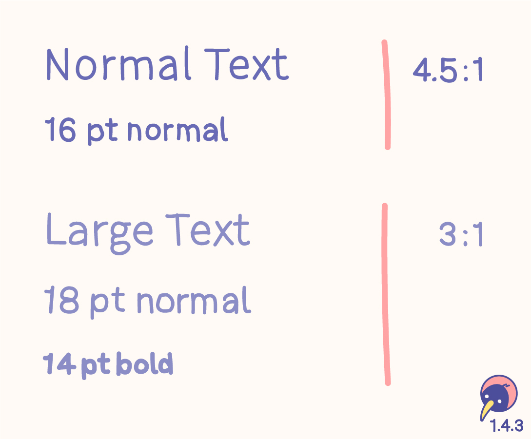
- Individual design, like an outline (at least 1 px), can support the contrast.
- Fonts are designed differently. Usually the sizes fit the requirements. If the font is smaller or thinner than average, the sizes for calculation should be adjusted.
- These definitions don’t forbid using smaller sizes. However, text should be resizable.
Text types
The contrast criterion only applies to neccessary text. If the text is important, it needs to be accessible. Imagine sitting outside and the sun is shining on your screen – what would you like to see?

Included
- Free text
- Important text on images
- Placeholder text
- Hover text
Excluded
- Logos
- Unimportant decorative text
Inactive
No guideline exists for inactive components. A disabled button doesn’t need to meet the contrast ratio. However, my recommendation is enough contrast on every component. If a disabled button doesn’t need to be identified by people with low vision – do we need this button at all?
Disabled elements are also mentioned in 1.4.1 Use of color, increasing the recommendation of avoiding inactive components.
Colors
The calculation of contrast verifies the color of the text on the background. While colors with enough contrast are important, functions and information shouldn‘t rely on color anyway.
Don‘t block the process of defining a color system by trying to find the contrast between the colors but rather between the colors and their backgrounds.
Tools
Relations
- 1.4.6 Contrast (enhanced) (AAA) raises “Normal” to 7:1 and “Large” to 4.5:1.
- 1.4.4 Resize text (AA) reveals, that font sizes are not absolute.
Alternative
- Technique G174: If the contrast can’t be reached, a control or an alternative page with sufficent contrast could be offered.
The visual presentation of text and images of text has a contrast ratio of at least 4.5:1, except for the following:
Large Text
Large-scale text and images of large-scale text have a contrast ratio of at least 3:1;
Incidental
Text or images of text that are part of an inactive user interface component, that are pure decoration, that are not visible to anyone, or that are part of a picture that contains significant other visual content, have no contrast requirement.
Logotypes
Text that is part of a logo or brand name has no contrast requirement.
Resize Text
- Level
- AA
- Criterion
- 1.4.4
Individual text zoom sizes of up to 200 % are included in responsive design.
- Content
- Responsive
Sizes
The minimal required zoom size of text is 200 %. If a website is responsive, the possibility of completely zooming in and out is already included.
Text types
Users may benefit from scaling all content on the Web page, but text is most critical.
(w3.org)
Included
- Free text
Excluded
- Captions
- Images of text
While this criterion focuses on text, having a completely responsive website wouldn’t hurt.
Users
Prejudices imply the requirement of zooming in, however, people with, for example, tunnel vision also need to zoom out. People are different; a friend of mine has a lot of small text on his development screen, while a businesswoman in Vienna enlarges the entire text on her smartphone.
Alternative
- Technique G178: A website could include controlled buttons for zooming in and out.
Except for captions and images of text, text can be resized without assistive technology up to 200 percent without loss of content or functionality.
Images of Text
- Level
- AA
- Criterion
- 1.4.5
Text is pure text, not an image, unless it is a visual customisation, a particular presentation or a logotype.
- Content
- Image
- Text
If the technologies being used can achieve the visual presentation, text is used to convey information rather than images of text except for the following:
Customizable
The image of text can be visually customized to the user’s requirements;
Essential
A particular presentation of text is essential to the information being conveyed.
Note
Logotypes (text that is part of a logo or brand name) are considered essential.
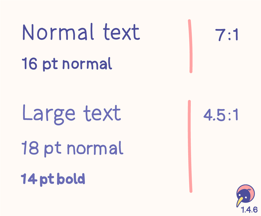
Contrast (Enhanced)
- Level
- AAA
- Criterion
- 1.4.6
Text has higher contrast (7:1 or 4.5:1) to be readable for everyone everywhere.
- Content
- Color
- Image
- Text
Sizes
In addition to 1.4.3 Contrast (minimum) (AA), this criterion raises the values.
- “Normal” text with 16 pt normal should have a contrast ratio of at least 7:1.
- “Large” text with 18 pt normal or 14 pt bold should have a contrast ratio of at least 4.5:1.
- Sizings have evolved – the values in pt are just a guideline.
- The contrast could be higher than these requirements!
Usage
The 7:1 level therefore generally provides compensation for the loss in contrast sensitivity experienced by users with low vision who do not use assistive technology and provides contrast enhancement for color deficiency as well.
(w3.org)
Matching this criterion would be great, it can very difficult when creating a design system, though. AA should definitely be fulfilled, AAA should be considered.
Relation
- 1.4.3 Contrast (minimum) (AA) is based on 3:1 for “Large” and 4.5:1 for “Normal”. The documentation contains all details of this topic.
The visual presentation of text and images of text has a contrast ratio of at least 7:1, except for the following:
Large Text
Large-scale text and images of large-scale text have a contrast ratio of at least 4.5:1;
Incidental
Text or images of text that are part of an inactive user interface component, that are pure decoration, that are not visible to anyone, or that are part of a picture that contains significant other visual content, have no contrast requirement.
Logotypes
Text that is part of a logo or brand name has no contrast requirement.
Low or No Background Audio
- Level
- AAA
- Criterion
- 1.4.7
Audio-only content has either no background sounds, very low background sounds or the background sounds can be turned off.
- Function
- Audio
For prerecorded audio-only content that (1) contains primarily speech in the foreground, (2) is not an audio CAPTCHA or audio logo, and (3) is not vocalization intended to be primarily musical expression such as singing or rapping, at least one of the following is true:
No Background
The audio does not contain background sounds.
Turn Off
The background sounds can be turned off.
20 dB
The background sounds are at least 20 decibels lower than the foreground speech content, with the exception of occasional sounds that last for only one or two seconds.
Note
Per the definition of “decibel,” background sound that meets this requirement will be approximately four times quieter than the foreground speech content.
Visual Presentation
- Level
- AAA
- Criterion
- 1.4.8
The visualisation of text is adjustable by browser functions or user agents.
- Development
For the visual presentation of blocks of text, a mechanism is available to achieve the following:
Foreground and background colors can be selected by the user.
Width is no more than 80 characters or glyphs (40 if CJK).
Text is not justified (aligned to both the left and the right margins).
Line spacing (leading) is at least space-and-a-half within paragraphs, and paragraph spacing is at least 1.5 times larger than the line spacing.
Text can be resized without assistive technology up to 200 percent in a way that does not require the user to scroll horizontally to read a line of text on a full-screen window.
Note 1
Content is not required to use these values. The requirement is that a mechanism is available for users to change these presentation aspects. The mechanism can be provided by the browser or other user agent. Content is not required to provide the mechanism.
Note 2
Writing systems for some languages use different presentation aspects to improve readability and legibility. If a presentation aspect in this success criterion is not used in a writing system, content in that writing system does not need to use that presentation setting and can conform without it. Authors are encouraged to follow guidance for improving readability and legibility of text in their writing system.
Images of Text (No Exception)
- Level
- AAA
- Criterion
- 1.4.9
Text is pure text, not an image, unless it is a logotype.
- Content
- Image
- Text
Images of text are only used for pure decoration or where a particular presentation of text is essential to the information being conveyed.
Note
Logotypes (text that is part of a logo or brand name) are considered essential.
Reflow
- Level
- AA
- Criterion
- 1.4.10
Individual text zoom sizes of up to 400 % are included in responsive design.
- Content
- Responsive
Content can be presented without loss of information or functionality, and without requiring scrolling in two dimensions for:
Vertical scrolling content at a width equivalent to 320 CSS pixels;
Horizontal scrolling content at a height equivalent to 256 CSS pixels.
Except for parts of the content which require two-dimensional layout for usage or meaning.
Note 1
320 CSS pixels is equivalent to a starting viewport width of 1280 CSS pixels wide at 400% zoom. For web content which is designed to scroll horizontally (e.g., with vertical text), 256 CSS pixels is equivalent to a starting viewport height of 1024 CSS pixels at 400% zoom.
Note 2
Examples of content which requires two-dimensional layout are images required for understanding (such as maps and diagrams), video, games, presentations, data tables (not individual cells), and interfaces where it is necessary to keep toolbars in view while manipulating content. It is acceptable to provide two-dimensional scrolling for such parts of the content.
Non-text Contrast
- Level
- AA
- Criterion
- 1.4.11
UI and graphics have high contrast (3:1) to be usable for everyone everywhere.
- Content
- Color
- Icon
- Image
The visual presentation of the following have a contrast ratio of at least 3:1 against adjacent color(s):
User Interface Components
Visual information required to identify user interface components and states, except for inactive components or where the appearance of the component is determined by the user agent and not modified by the author;
Graphical Objects
Parts of graphics required to understand the content, except when a particular presentation of graphics is essential to the information being conveyed.
Text Spacing
- Level
- AA
- Criterion
- 1.4.12
Responsive design includes personalised text spacing.
- Content
- Layout
- Responsive
In content implemented using markup languages that support the following text style properties, no loss of content or functionality occurs by setting all of the following and by changing no other style property:
Line height (line spacing) to at least 1.5 times the font size;
Spacing following paragraphs to at least 2 times the font size;
Letter spacing (tracking) to at least 0.12 times the font size;
Word spacing to at least 0.16 times the font size.
Exception: Human languages and scripts that do not make use of one or more of these text style properties in written text can conform using only the properties that exist for that combination of language and script.
Note 1
Content is not required to use these text spacing values. The requirement is to ensure that when a user overrides the authored text spacing, content or functionality is not lost.
Note 2
Writing systems for some languages use different text spacing settings, such as paragraph start indent. Authors are encouraged to follow locally available guidance for improving readability and legibility of text in their writing system.
Content on Hover or Focus
- Level
- AA
- Criterion
- 1.4.13
Tooltips and hover-menus have bad usability. If there is no way around, they have to be visible while hovering over the whole element and be dismissible by a different interaction.
- Function
- Cursor
- Keyboard
- Touch
Where receiving and then removing pointer hover or keyboard focus triggers additional content to become visible and then hidden, the following are true:
Dismissible
A mechanism is available to dismiss the additional content without moving pointer hover or keyboard focus, unless the additional content communicates an input error or does not obscure or replace other content;
Hoverable
If pointer hover can trigger the additional content, then the pointer can be moved over the additional content without the additional content disappearing;
Persistent
The additional content remains visible until the hover or focus trigger is removed, the user dismisses it, or its information is no longer valid.
Exception: The visual presentation of the additional content is controlled by the user agent and is not modified by the author.
Note 1
Examples of additional content controlled by the user agent include browser tooltips created through use of the HTML title attribute [HTML].
Note 2
Custom tooltips, sub-menus, and other nonmodal popups that display on hover and focus are examples of additional content covered by this criterion.
Note 3
This criterion applies to content that appears in addition to the triggering component itself. Since hidden components that are made visible on keyboard focus (such as links used to skip to another part of a page) do not present additional content they are not covered by this criterion.
Keyboard
- Level
- A
- Criterion
- 2.1.1
Every action is (in addition to the original interaction) possible with a keyboard, unless input movement is required.
- Development
All functionality of the content is operable through a keyboard interface without requiring specific timings for individual keystrokes, except where the underlying function requires input that depends on the path of the user’s movement and not just the endpoints.
Note 1
This exception relates to the underlying function, not the input technique. For example, if using handwriting to enter text, the input technique (handwriting) requires path-dependent input but the underlying function (text input) does not.
Note 2
This does not forbid and should not discourage providing mouse input or other input methods in addition to keyboard operation.
No Keyboard Trap
- Level
- A
- Criterion
- 2.1.2
Everything that can be entered via keyboard has the option to be left via keyboard.
- Interaction
- Keyboard
If keyboard focus can be moved to a component of the page using a keyboard interface, then focus can be moved away from that component using only a keyboard interface, and, if it requires more than unmodified arrow or tab keys or other standard exit methods, the user is advised of the method for moving focus away.
Note
Since any content that does not meet this success criterion can interfere with a user's ability to use the whole page, all content on the web page (whether it is used to meet other success criteria or not) must meet this success criterion. See Conformance Requirement 5: Non-Interference.
Keyboard (No Exception)
- Level
- AAA
- Criterion
- 2.1.3
Every action is (in addition to the original interaction) possible with a keyboard.
- Development
All functionality of the content is operable through a keyboard interface without requiring specific timings for individual keystrokes.
Character Key Shortcuts
- Level
- A
- Criterion
- 2.1.4
Single key shortcuts can be turned off, personalised, or disabled until the function is on focus.
- Function
- Keyboard
- Settings
If a keyboard shortcut is implemented in content using only letter (including upper- and lower-case letters), punctuation, number, or symbol characters, then at least one of the following is true:
Turn off
A mechanism is available to turn the shortcut off;
Remap
A mechanism is available to remap the shortcut to include one or more non-printable keyboard keys (e.g., Ctrl, Alt);
Active only on focus
The keyboard shortcut for a user interface component is only active when that component has focus.
Timing Adjustable
- Level
- A
- Criterion
- 2.2.1
Time limits have the possibility to be turned off, adjusted or extended, unless they are essential or longer than 20 hours.
- Function
For each time limit that is set by the content, at least one of the following is true:
Turn off
The user is allowed to turn off the time limit before encountering it; or
Adjust
The user is allowed to adjust the time limit before encountering it over a wide range that is at least ten times the length of the default setting; or
Extend
The user is warned before time expires and given at least 20 seconds to extend the time limit with a simple action (for example, “press the space bar”), and the user is allowed to extend the time limit at least ten times; or
Real-time Exception
The time limit is a required part of a real-time event (for example, an auction), and no alternative to the time limit is possible; or
Essential Exception
The time limit is essential and extending it would invalidate the activity; or
20 Hour Exception
The time limit is longer than 20 hours.
Note
This success criterion helps ensure that users can complete tasks without unexpected changes in content or context that are a result of a time limit. This success criterion should be considered in conjunction with Success Criterion 3.2.1, which puts limits on changes of content or context as a result of user action.
Pause, Stop, Hide
- Level
- A
- Criterion
- 2.2.2
Active content (moving, blinking, scrolling, auto-updating) can be paused, stopped, hidden or the frequency can be adjusted.
- Function
- Image
- Text
- Video
For moving, blinking, scrolling, or auto-updating information, all of the following are true:
Moving, blinking, scrolling
For any moving, blinking or scrolling information that (1) starts automatically, (2) lasts more than five seconds, and (3) is presented in parallel with other content, there is a mechanism for the user to pause, stop, or hide it unless the movement, blinking, or scrolling is part of an activity where it is essential; and
Auto-updating
For any auto-updating information that (1) starts automatically and (2) is presented in parallel with other content, there is a mechanism for the user to pause, stop, or hide it or to control the frequency of the update unless the auto-updating is part of an activity where it is essential.
Note 1
For requirements related to flickering or flashing content, refer to Guideline 2.3.
Note 2
Since any content that does not meet this success criterion can interfere with a user's ability to use the whole page, all content on the web page (whether it is used to meet other success criteria or not) must meet this success criterion. See Conformance Requirement 5: Non-Interference.
Note 3
Content that is updated periodically by software or that is streamed to the user agent is not required to preserve or present information that is generated or received between the initiation of the pause and resuming presentation, as this may not be technically possible, and in many situations could be misleading to do so.
Note 4
An animation that occurs as part of a preload phase or similar situation can be considered essential if interaction cannot occur during that phase for all users and if not indicating progress could confuse users or cause them to think that content was frozen or broken.
No Timing
- Level
- AAA
- Criterion
- 2.2.3
User are provided with as much time as needed.
- Function
Timing is not an essential part of the event or activity presented by the content, except for non-interactive synchronized media and real-time events.
Interruptions
- Level
- AAA
- Criterion
- 2.2.4
Interruptions (unless they are an emergency) can be delayed or turned off.
- Content
- Function
Interruptions can be postponed or suppressed by the user, except interruptions involving an emergency.
Re-authenticating
- Level
- AAA
- Criterion
- 2.2.5
No data is lost when a user gets logged out.
- Development
When an authenticated session expires, the user can continue the activity without loss of data after re-authenticating.
Timeouts
- Level
- AAA
- Criterion
- 2.2.6
No data is lost unless the user receives a warning or 20 hours of inactivity have passed.
- Content
- Text
Users are warned of the duration of any user inactivity that could cause data loss, unless the data is preserved for more than 20 hours when the user does not take any actions.
Note
Privacy regulations may require explicit user consent before user identification has been authenticated and before user data is preserved. In cases where the user is a minor, explicit consent may not be solicited in most jurisdictions, countries or regions. Consultation with privacy professionals and legal counsel is advised when considering data preservation as an approach to satisfy this success criterion.
Three Flashes or Below Threshold
- Level
- A
- Criterion
- 2.3.1
Avoid flashes. If flashes are still required, they are limited to three flashes per second or are under thresholds.
- Content
Web pages do not contain anything that flashes more than three times in any one second period, or the flash is below the general flash and red flash thresholds.
Note
Since any content that does not meet this success criterion can interfere with a user's ability to use the whole page, all content on the web page (whether it is used to meet other success criteria or not) must meet this success criterion. See Conformance Requirement 5: Non-Interference.
Three Flashes
- Level
- AAA
- Criterion
- 2.3.2
Really avoid flashes.
- Content
Web pages do not contain anything that flashes more than three times in any one second period.
Animation from Interactions
- Level
- AAA
- Criterion
- 2.3.3
Animations happening after interactions can be turned off.
- Function
- Settings
Motion animation triggered by interaction can be disabled, unless the animation is essential to the functionality or the information being conveyed.
Bypass Blocks
- Level
- A
- Criterion
- 2.4.1
Keyboard users can skip repeated content.
- Function
- Keyboard
A mechanism is available to bypass blocks of content that are repeated on multiple web pages.
Page Titled
- Level
- A
- Criterion
- 2.4.2
Each page has a useful title. It starts with the page title and ends with the site title for easy browser tab overview.
- Content
- Text
Web pages have titles that describe topic or purpose.
Focus Order
- Level
- A
- Criterion
- 2.4.3
Focus order aligns with visual order.
- Development
If a web page can be navigated sequentially and the navigation sequences affect meaning or operation, focusable components receive focus in an order that preserves meaning and operability.
Link Purpose (In Context)
- Level
- A
- Criterion
- 2.4.4
Link texts or their context describe their purpose.
- Content
- Text
The purpose of each link can be determined from the link text alone or from the link text together with its programmatically determined link context, except where the purpose of the link would be ambiguous to users in general.
Multiple Ways
- Level
- AA
- Criterion
- 2.4.5
Pages can be reached through multiple ways, not just one.
- Function
More than one way is available to locate a web page within a set of web pages except where the web page is the result of, or a step in, a process.
Headings and Labels
- Level
- AA
- Criterion
- 2.4.6
Section headings and labels are clear and descriptive for better navigation.
- Content
- Heading
- Label
- Text
Wording
- Clear structure for easy understanding.
- Clarified purpose of the content or the component.
- Start with the most important (descriptive) information.
- #Unique headings are beneficial.
- Clarity out of context is beneficial.
- One word or a single character may suffice.
Users
People with screen readers as well as people with visual perception usually navigate by grasping the first words when jumping from heading to heading.
Headings
<!-- Recommended -->
<h1>Kiwi preparation</h1>
<h2>Hatching</h2>
<h2>Growing</h2>

<!-- Not Recommended -->
<h1>Preparation for Kiwi</h1>
<h2>Preparation for Hatching</h2>
<h2>Preparation for Growing</h2>

<!-- Not Recommended -->
<h1>Preparation</h1>
<h2>Preparation</h2>
<h2>Preparation</h2>
Labels
Form input controls with labels that clearly describe the content that is expected to be entered helps users know how to successfully complete the form.
(w3.org)
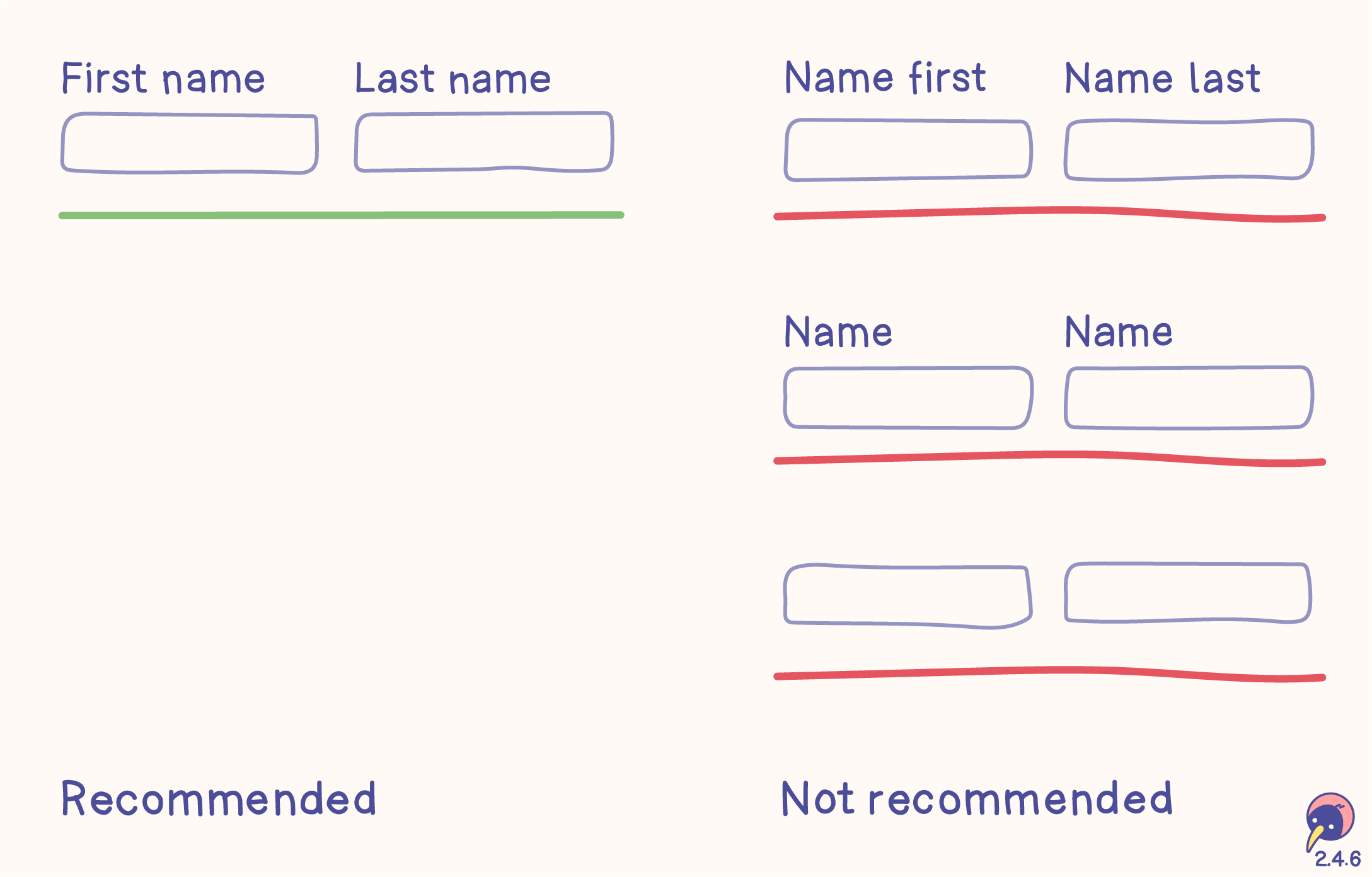
Recommended
- “First Name” and “Last Name” clearly define the input. Starting with “First” and “Last” makes navigation faster in the “Name” group.
Not recommended
- Starting with “Name” for “First” and “Last”, because the input fields are in the “Name” group and don’t need this definition every time.
- Using the same label more than once in a group without clear differentiation, which part of the name is required.
- No label. They are not neccessarily required for this criterion, however, they should be included for better accessibility and fulfilling other criteria, for example 3.3.2: Labels or instructions.
Relations
- 1.3.1: Info and relationships (A) for programmatical determination.
- 2.4.4: Page titled (A) for navigation through pages and tabs.
- 3.3.2: Labels or instructions (A) as more detailed requirement for labels.
- 4.1.2: Name, role, value (A) for programmatical determination.
Headings and labels describe topic or purpose.
Focus Visible
- Level
- AA
- Criterion
- 2.4.7
Keyboard focus can be visible.
- Function
- Keyboard
- Text
Any keyboard operable user interface has a mode of operation where the keyboard focus indicator is visible.
Location
- Level
- AAA
- Criterion
- 2.4.8
Reveal the position of the current page in the site.
- Content
Information about the user's location within a set of web pages is available.
Link Purpose (Link Only)
- Level
- AAA
- Criterion
- 2.4.9
Link texts describe their purpose.
- Content
- Text
A mechanism is available to allow the purpose of each link to be identified from link text alone, except where the purpose of the link would be ambiguous to users in general.
Section Headings
- Level
- AAA
- Criterion
- 2.4.10
Every content section is described with a heading.
- Content
- Heading
- Text
Section headings are used to organize the content.
Note 1
“Heading” is used in its general sense and includes titles and other ways to add a heading to different types of content.
Note 2
This success criterion covers sections within writing, not user interface components. User interface components are covered under Success Criterion 4.1.2.
Focus Not Obscured (Minimum)
- Level
- AA
- Criterion
- 2.4.11
Keyboard focus keeps content at least partially visible.
- Function
- Keyboard
When a user interface component receives keyboard focus, the component is not entirely hidden due to author-created content.
Note 1
Where content in a configurable interface can be repositioned by the user, then only the initial positions of user-movable content are considered for testing and conformance of this success criterion.
Note 2
Content opened by the user may obscure the component receiving focus. If the user can reveal the focused component without advancing the keyboard focus, the component with focus is not considered visually hidden due to author-created content.
Focus Not Obscured (Enhanced)
- Level
- AAA
- Criterion
- 2.4.12
Keyboard focus keeps content completely visible.
- Function
- Keyboard
When a user interface component receives keyboard focus, no part of the component is hidden by author-created content.
Focus Appearance
- Level
- AAA
- Criterion
- 2.4.13
Keyboard focus is easy to spot through sufficient size and contrast.
- Function
- Keyboard
When the keyboard focus indicator is visible, an area of the focus indicator meets all the following:
is at least as large as the area of a 2 CSS pixel thick perimeter of the unfocused component or sub-component, and
has a contrast ratio of at least 3:1 between the same pixels in the focused and unfocused states.
Exceptions:
The focus indicator is determined by the user agent and cannot be adjusted by the author, or
The focus indicator and the indicator's background color are not modified by the author.
Note 1
What is perceived as the user interface component or sub-component (to determine the perimeter) depends on its visual presentation. The visual presentation includes the component’s visible content, border, and component-specific background. It does not include shadow and glow effects outside the component's content, background, or border.
Note 2
Examples of sub-components that may receive a focus indicator are menu items in an opened drop-down menu, or focusable cells in a grid.
Note 3
Contrast calculations can be based on colors defined within the technology (such as HTML, CSS, and SVG). Pixels modified by user agent resolution enhancements and anti-aliasing can be ignored.
Pointer Gestures
- Level
- A
- Criterion
- 2.5.1
Functions have the (additional) option to be used with one pointer and without paths.
- Function
- Cursor
- Touch
All functionality that uses multipoint or path-based gestures for operation can be operated with a single pointer without a path-based gesture, unless a multipoint or path-based gesture is essential.
Note
This requirement applies to web content that interprets pointer actions (i.e., this does not apply to actions that are required to operate the user agent or assistive technology).
Pointer Cancellation
- Level
- A
- Criterion
- 2.5.2
Single finger or cursor interactions can be cancelled or undone.
- Interaction
- Cursor
- Touch
For functionality that can be operated using a single pointer, at least one of the following is true:
No Down-Event
The down-event of the pointer is not used to execute any part of the function;
Abort or Undo
Completion of the function is on the up-event, and a mechanism is available to abort the function before completion or to undo the function after completion;
Up Reversal
The up-event reverses any outcome of the preceding down-event;
Essential
Completing the function on the down-event is essential.
Note 1
Functions that emulate a keyboard or numeric keypad key press are considered essential.
Note 2
This requirement applies to web content that interprets pointer actions (i.e., this does not apply to actions that are required to operate the user agent or assistive technology).
Label in Name
- Level
- A
- Criterion
- 2.5.3
The (technical) label matches the visual text of the function for speech interaction.
- Development
For user interface components with labels that include text or images of text, the name contains the text that is presented visually.
Note
A best practice is to have the text of the label at the start of the name.
Motion Actuation
- Level
- A
- Criterion
- 2.5.4
Functions are operable on the UI. Device motion is an (optional) add-on.
- Function
- Cursor
- Touch
Functionality that can be operated by device motion or user motion can also be operated by user interface components and responding to the motion can be disabled to prevent accidental actuation, except when:
Supported Interface
The motion is used to operate functionality through an accessibility supported interface;
Essential
The motion is essential for the function and doing so would invalidate the activity.
Target Size (Enhanced)
- Level
- AAA
- Criterion
- 2.5.5
Function targets have a dimension of 44 × 44 px unless they have an equivalent link, are in a text, personalised or essential.
- Function
- Cursor
- Touch
The size of the target for pointer inputs is at least 44 by 44 CSS pixels except when:
Equivalent
The target is available through an equivalent link or control on the same page that is at least 44 by 44 CSS pixels;
Inline
The target is in a sentence or block of text;
User Agent Control
The size of the target is determined by the user agent and is not modified by the author;
Essential
A particular presentation of the target is essential to the information being conveyed.
Concurrent Input Mechanisms
- Level
- AAA
- Criterion
- 2.5.6
Different input technologies (like touch, cursor, speech or accessibility tools) can be used side by side.
- Development
Web content does not restrict use of input modalities available on a platform except where the restriction is essential, required to ensure the security of the content, or required to respect user settings.
Dragging Movements
- Level
- AA
- Criterion
- 2.5.7
Dragging actions offer a simple pointer alternative.
- Interaction
- Cursor
- Touch
All functionality that uses a dragging movement for operation can be achieved by a single pointer without dragging, unless dragging is essential or the functionality is determined by the user agent and not modified by the author.
Note
This requirement applies to web content that interprets pointer actions (i.e., this does not apply to actions that are required to operate the user agent or assistive technology).
Target Size (Minimum)
- Level
- AA
- Criterion
- 2.5.8
Function targets have a dimension of 24 × 24 px unless they have an equivalent link, are in a text, personalised or essential.
- Function
- Cursor
- Touch
The size of the target for pointer inputs is at least 24 by 24 CSS pixels, except when:
Spacing
Undersized targets (those less than 24 by 24 CSS pixels) are positioned so that if a 24 CSS pixel diameter circle is centered on the bounding box of each, the circles do not intersect another target or the circle for another undersized target;
Equivalent
The function can be achieved through a different control on the same page that meets this criterion;
Inline
The target is in a sentence or its size is otherwise constrained by the line-height of non-target text;
User Agent Control
The size of the target is determined by the user agent and is not modified by the author;
Essential
A particular presentation of the target is essential or is legally required for the information being conveyed.
Note 1
Targets that allow for values to be selected spatially based on position within the target are considered one target for the purpose of the success criterion. Examples include sliders, color pickers displaying a gradient of colors, or editable areas where you position the cursor.
Note 2
For inline targets the line-height should be interpreted as perpendicular to the flow of text. For example, in a language displayed vertically, the line-height would be horizontal.
Language of Page
- Level
- A
- Criterion
- 3.1.1
The predominant page language is defined in the code.
- Development
The default human language of each web page can be programmatically determined.
Language of Parts
- Level
- AA
- Criterion
- 3.1.2
Differing language of text parts is defined in the code.
- Development
The human language of each passage or phrase in the content can be programmatically determined except for proper names, technical terms, words of indeterminate language, and words or phrases that have become part of the vernacular of the immediately surrounding text.
Unusual Words
- Level
- AAA
- Criterion
- 3.1.3
Descriptions for difficult words are provided.
- Content
- Text
A mechanism is available for identifying specific definitions of words or phrases used in an unusual or restricted way, including idioms and jargon.
Abbreviations
- Level
- AAA
- Criterion
- 3.1.4
Descriptions for difficult abbreviations are provided.
- Content
- Text
A mechanism for identifying the expanded form or meaning of abbreviations is available.
Reading Level
- Level
- AAA
- Criterion
- 3.1.5
Difficult text is available as simplified text to be understandable for everyone.
- Content
- Text
When text requires reading ability more advanced than the lower secondary education level after removal of proper names and titles, supplemental content, or a version that does not require reading ability more advanced than the lower secondary education level, is available.
Pronunciation
- Level
- AAA
- Criterion
- 3.1.6
Pronunciations for unclear words are provided.
- Content
- Text
A mechanism is available for identifying specific pronunciation of words where meaning of the words, in context, is ambiguous without knowing the pronunciation.
On Focus
- Level
- A
- Criterion
- 3.2.1
Only predictable actions happen when focus is received.
- Function
- Keyboard
When any user interface component receives focus, it does not initiate a change of context.
On Input
- Level
- A
- Criterion
- 3.2.2
Only predictable actions happen when something receives input, unless the explanation of the action was provided.
- Function
- Input
Changing the setting of any user interface component does not automatically cause a change of context unless the user has been advised of the behavior before using the component.
Consistent Navigation
- Level
- AA
- Criterion
- 3.2.3
Navigation stays consistent on all pages.
- Function
- Layout
Navigational mechanisms that are repeated on multiple web pages within a set of web pages occur in the same relative order each time they are repeated, unless a change is initiated by the user.
Consistent Identification
- Level
- AA
- Criterion
- 3.2.4
Functions stay consistent on all pages.
- Function
- Text
Components that have the same functionality within a set of web pages are identified consistently.
Change on Request
- Level
- AAA
- Criterion
- 3.2.5
Users decide about every function.
- Function
Changes of context are initiated only by user request or a mechanism is available to turn off such changes.
Consistent Help
- Level
- A
- Criterion
- 3.2.6
Help and support are always displayed at the same position.
- Function
If a web page contains any of the following help mechanisms, and those mechanisms are repeated on multiple web pages within a set of web pages, they occur in the same order relative to other page content, unless a change is initiated by the user:
Human contact details;
Human contact mechanism;
Self-help option;
A fully automated contact mechanism.
Note 1
Help mechanisms may be provided directly on the page, or may be provided via a direct link to a different page containing the information.
Note 2
For this success criterion, “the same order relative to other page content” can be thought of as how the content is ordered when the page is serialized. The visual position of a help mechanism is likely to be consistent across pages for the same page variation (e.g., CSS break-point). The user can initiate a change, such as changing the page's zoom or orientation, which may trigger a different page variation. This criterion is concerned with relative order across pages displayed in the same page variation (e.g., same zoom level and orientation).
Error Identification
- Level
- A
- Criterion
- 3.3.1
Input errors are marked and described.
- Function
- Input
If an input error is automatically detected, the item that is in error is identified and the error is described to the user in text.
Labels or Instructions
- Level
- A
- Criterion
- 3.3.2
Functions are described with labels or instructions.
- Function
- Input
Labels or instructions are provided when content requires user input.
Error Suggestion
- Level
- AA
- Criterion
- 3.3.3
Help is provided for solving errors.
- Content
- Input
If an input error is automatically detected and suggestions for correction are known, then the suggestions are provided to the user, unless it would jeopardize the security or purpose of the content.
Error Prevention (Legal, Financial, Data)
- Level
- AA
- Criterion
- 3.3.4
Legal, financial or data submissions can be checked, reversed or confirmed.
- Function
For web pages that cause legal commitments or financial transactions for the user to occur, that modify or delete user-controllable data in data storage systems, or that submit user test responses, at least one of the following is true:
Reversible
Submissions are reversible.
Checked
Data entered by the user is checked for input errors and the user is provided an opportunity to correct them.
Confirmed
A mechanism is available for reviewing, confirming, and correcting information before finalizing the submission.
Help
- Level
- AAA
- Criterion
- 3.3.5
Context-sensitive help is available.
- Function
Context-sensitive help is available.
Error Prevention (All)
- Level
- AAA
- Criterion
- 3.3.6
Submissions are reversible, checked for input errors or corrected before finalisation.
- Function
For web pages that require the user to submit information, at least one of the following is true:
Reversible
Submissions are reversible.
Checked
Data entered by the user is checked for input errors and the user is provided an opportunity to correct them.
Confirmed
A mechanism is available for reviewing, confirming, and correcting information before finalizing the submission.
Redundant Entry
- Level
- A
- Criterion
- 3.3.7
Information entered by the user is only required once during a process.
- Content
- Text
Information previously entered by or provided to the user that is required to be entered again in the same process is either:
auto-populated, or
available for the user to select.
Except when:
re-entering the information is essential,
the information is required to ensure the security of the content, or
previously entered information is no longer valid.
Accessible Authentication (Minimum
- Level
- AA
- Criterion
- 3.3.8
If old-school authentication methods are used an alternative without solving, recalling or transcribing is required.
- Content
- Text
A cognitive function test (such as remembering a password or solving a puzzle) is not required for any step in an authentication process unless that step provides at least one of the following:
Alternative
Another authentication method that does not rely on a cognitive function test.
Mechanism
A mechanism is available to assist the user in completing the cognitive function test.
Object Recognition
The cognitive function test is to recognize objects.
Personal Content
The cognitive function test is to identify non-text content the user provided to the website.
Note 1
"Object recognition" and "Personal content" may be represented by images, video, or audio.
Note 2
Examples of mechanisms that satisfy this criterion include:
support for password entry by password managers to reduce memory need, and
copy and paste to reduce the cognitive burden of re-typing.
Accessible Authentication (Enhanced)
- Level
- AAA
- Criterion
- 3.3.9
If old-school authentication methods are used an alternative without recognition is offered.
- Content
- Text
A cognitive function test (such as remembering a password or solving a puzzle) is not required for any step in an authentication process unless that step provides at least one of the following:
Alternative
Another authentication method that does not rely on a cognitive function test.
Mechanism
A mechanism is available to assist the user in completing the cognitive function test.
Parsing (Obsolete and removed)
- Level
- A
- Criterion
- 4.1.1
Note
This criterion was originally adopted to address problems that assistive technology had directly parsing HTML. Assistive technology no longer has any need to directly parse HTML. Consequently, these problems either no longer exist or are addressed by other criteria. This criterion no longer has utility and is removed.
Name, Role, Value
- Level
- A
- Criterion
- 4.1.2
Components can be described by assistive technology.
- Development
For all user interface components (including but not limited to: form elements, links and components generated by scripts), the name and role can be programmatically determined; states, properties, and values that can be set by the user can be programmatically set; and notification of changes to these items is available to user agents, including assistive technologies.
Note
This success criterion is primarily for web authors who develop or script their own user interface components. For example, standard HTML controls already meet this success criterion when used according to specification.
Status Messages
- Level
- AA
- Criterion
- 4.1.3
Status messages can be presented to assistive technology.
- Development
In content implemented using markup languages, status messages can be programmatically determined through role or properties such that they can be presented to the user by assistive technologies without receiving focus.
Non-text content has a text alternative to offer a higher usability.