Sizes
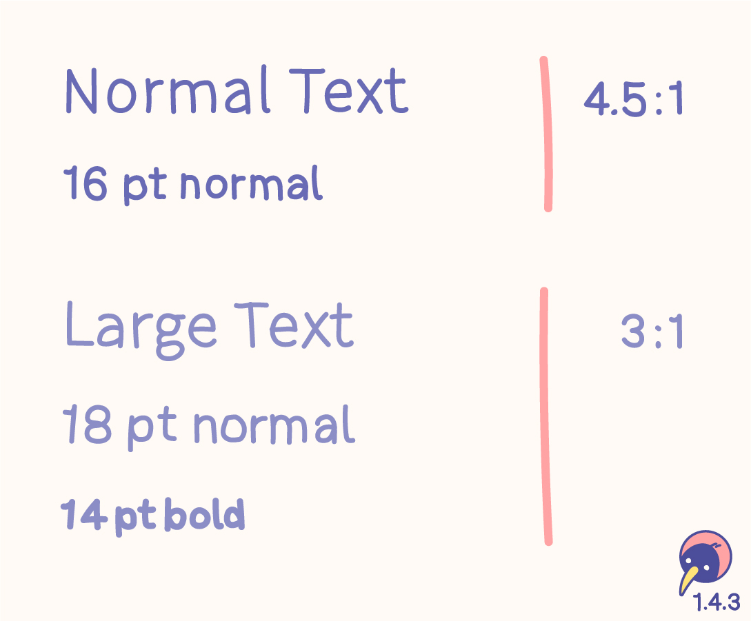
- “Normal” text with 16 pt normal needs a contrast ratio of at least 4.5:1.
- “Large” text with 18 pt normal or 14 pt bold needs a contrast ratio of at least 3:1.
- Sizings have evolved – the values in pt are just a guideline.
- The contrast can be higher than these requirements!
- Individual design, like an outline (at least 1 px), can support the contrast.
- Fonts are designed differently. Usually the sizes fit the requirements. If the font is smaller or thinner than average, the sizes for calculation should be adjusted.
- These definitions don’t forbid using smaller sizes. However, text should be resizable.
Text types
The contrast criterion only applies to neccessary text. If the text is important, it needs to be accessible. Imagine sitting outside and the sun is shining on your screen – what would you like to see?

Included
- Free text
- Important text on images
- Placeholder text
- Hover text
Excluded
- Logos
- Unimportant decorative text
Inactive
No guideline exists for inactive components. A disabled button doesn’t need to meet the contrast ratio. However, my recommendation is enough contrast on every component. If a disabled button doesn’t need to be identified by people with low vision – do we need this button at all?
Disabled elements are also mentioned in 1.4.1 Use of color, increasing the recommendation of avoiding inactive components.
Colors
The calculation of contrast verifies the color of the text on the background. While colors with enough contrast are important, functions and information shouldn‘t rely on color anyway.
Don‘t block the process of defining a color system by trying to find the contrast between the colors but rather between the colors and their backgrounds.
Tools
Relations
- 1.4.6 Contrast (enhanced) (AAA) raises “Normal” to 7:1 and “Large” to 4.5:1.
- 1.4.4 Resize text (AA) reveals, that font sizes are not absolute.
Alternative
- Technique G174: If the contrast can’t be reached, a control or an alternative page with sufficent contrast could be offered.
The visual presentation of text and images of text has a contrast ratio of at least 4.5:1, except for the following:
Large Text
Large-scale text and images of large-scale text have a contrast ratio of at least 3:1;
Incidental
Text or images of text that are part of an inactive user interface component, that are pure decoration, that are not visible to anyone, or that are part of a picture that contains significant other visual content, have no contrast requirement.
Logotypes
Text that is part of a logo or brand name has no contrast requirement.
Text has high contrast (4.5:1 or 3:1) to be readable for everyone everywhere.