Sizes
In addition to 1.4.3 Contrast (minimum) (AA), this criterion raises the values.
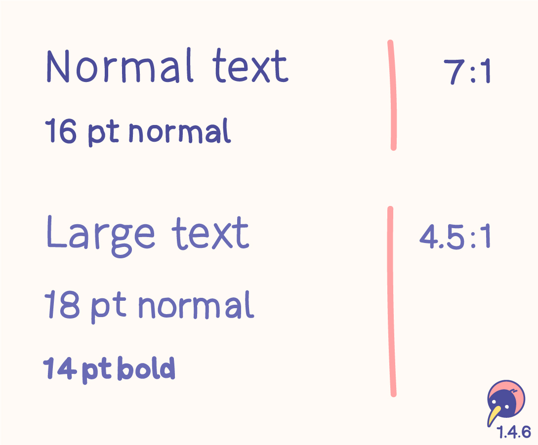
- “Normal” text with 16 pt normal should have a contrast ratio of at least 7:1.
- “Large” text with 18 pt normal or 14 pt bold should have a contrast ratio of at least 4.5:1.
- Sizings have evolved – the values in pt are just a guideline.
- The contrast could be higher than these requirements!
Usage
The 7:1 level therefore generally provides compensation for the loss in contrast sensitivity experienced by users with low vision who do not use assistive technology and provides contrast enhancement for color deficiency as well.
(w3.org)
Matching this criterion would be great, it can very difficult when creating a design system, though. AA should definitely be fulfilled, AAA should be considered.
Relation
- 1.4.3 Contrast (minimum) (AA) is based on 3:1 for “Large” and 4.5:1 for “Normal”. The documentation contains all details of this topic.
The visual presentation of text and images of text has a contrast ratio of at least 7:1, except for the following:
Large Text
Large-scale text and images of large-scale text have a contrast ratio of at least 4.5:1;
Incidental
Text or images of text that are part of an inactive user interface component, that are pure decoration, that are not visible to anyone, or that are part of a picture that contains significant other visual content, have no contrast requirement.
Logotypes
Text that is part of a logo or brand name has no contrast requirement.
Text has higher contrast (7:1 or 4.5:1) to be readable for everyone everywhere.